Sausage Party – 2 DOs & 1 DON’T for Animating Controversy
The Magic of Animation
Using animation is like a magic trick. It instantly takes your audience out of their normal routine; audiences are open to animated ideas that they’d never consider IRL. This is why animation can be so powerful: it carries audiences away to a land where anything is possible.
How does this magic spell work? How do animators establish the right balance of atmosphere, character design, sound and motion to grab and hold an audience’s attention? Most importantly, how can you apply these lessons to your Powtoons and your business?
To find out, I sat down with Nir Philosof, Powtoon’s lead character designer, to dissect an extreme case. We discovered three key Dos and Don’ts that will help keep audiences glued to their seats. If you can’t afford for your message to be ignored, you’ll want to know what we uncovered.
Sausage Party
In the summer of 2016, the very first wide-release, R-rated animated film hit theaters. Sausage Party, brainchild of the ever raunchy, often stoned Seth Rogan, is a fever-dream alternate reality where food has a personality, and their greatest dream is to be purchased and taken from the supermarket to “The Great Beyond.”
Frank (a hot dog) and his love interest, Brenda (a hot dog bun), discover that what awaits them in The Great Beyond isn’t eternal joy, but a torture kitchen of chopping, frying and gnashing of teeth.

Cute Characters – Sticky Subjects
The writers of this film use their cute characters to tackle sticky subjects. The great beyond is an allegory for heaven. But the film doesn’t stop at a critique of religion. They also dive into homosexuality, drug use, revenge, racism – even the Middle East conflict.

I asked Nir his opinion of how Sausage Party was able to broach such controversial issues – in a raunchy way, no less – without turning audiences off:
“That’s a great question. If the animation is done well, people are more comfortable with the message. That’s why movie theaters show animated ads with dancing popcorn and candies. If the theater manager came on the screen and said, “Don’t forget to spend more money,” the audience wouldn’t listen. Of course he wants you to spend more money. But if the popcorn is dancing, and he’s smiling with his candy friends, and he’s reminding you how much you love snacks, you’re already more open.”
How far can animation take an audience?
“Pretty far, as long as the animation resonates with the audience. So if you think of When the Wind Blows, which was made in the U.K. in the 1980s, they showed a normal British couple surviving a nuclear attack. If it had been a live-action film, it might have been harder for audiences to swallow. But the friendly, round faces of the main characters and their husband-wife conversation style helped audiences relate.”
How does this work in Sausage Party?
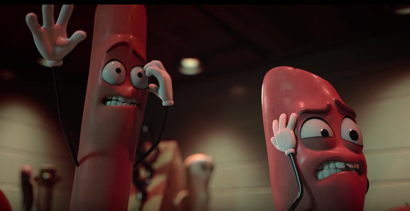
“In Sausage Party the characters have big eyes and very expressive faces. They look almost like Betty Boop or characters from that era, but with a Pixar looking finish. The way they move is cartoonish and goofy — but the words coming out of them and the scenario they’re facing is totally incongruous. So you want to connect with the characters because of how they’re drawn, and you laugh because of how ridiculous the whole thing is.”
What makes animation such a powerful approach?
“Most don’t see animation as a medium that can address a serious subject. So because they don’t see the serious message coming, they’re open in a way they never would be with traditional film. In the case of Sausage Party, they’re ultimately out to entertain, so they play up the incongruous and the silly. And even here, they’re challenging audiences to laugh about serious stuff. I think you will see R-rated animated films every year from now on.”
2 DOs & 1 DON’T
With Nir’s insights in hand, I wanted to see what the makers of Sausage Party themselves said about their film. I uncovered two important “DOs” and one essential “DON’T” every animator (EVEN YOU!) needs to know.
DO — Create a point of view
The first step to tackling taboo subject matter is to create a point of view that resonates with the audience.
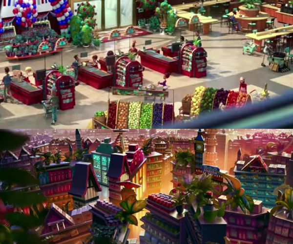
Sausage Party’s co-director, Conrad Vernon, said, “If you really look at the movie, you can see that when we’re in the food’s point of view, it’s a lot more colorful and we have a lot more saturation, and the camera angles are more dynamic, and the music is scored to be big and full. When we go back to the human point of view, we desaturated everything, and kept a locked-off camera most of the time, and put canned, cheesy grocery store music, just to make the food’s world much more interesting and much huger, because this is the way they’re seeing the grocery store.”

By making the food’s point of view more engaging and rich, the audience automatically sympathizes with them. Their senses are more deeply stimulated and they’re drawn into sympathy with the bright, saturated food characters.
In animation, setting up the vibe, the color and the backgrounds to create an inviting point of view is essential.
DO — Match familiar animation styles
Once you win your audience to your point of view, the animation itself has to be relatable. Remember, we’ve been conditioned since childhood to trust and enjoy animation. So why not match the same animation styles that conditioned your audience in the first place?
That’s exactly what they did for Sausage Party. “We had the animators actually go in and take shots from old Bob Clampett cartoons, and Popeyes and Chuck Jones stuff, and literally rotoscope our character over it to make sure that they could do all the crazy stuff that those old cartoons did, so that we could get a really good, loose 2D-animated feel to these characters.”
DON’T — Enter the uncanny valley of realism
If you want your audience transported to a fantasy land, the fantasy must include character design. Especially if your subject matter is challenging or unexpected, avoiding realism is key to maintaining animations secret spell.
According to Vernon, “As far as the characters were concerned, we needed to make them appealing, and as you say, cute and lovable, because of the stuff that?s going on. If we actually went too into that uncanny valley of realism, a lot of this stuff would just become disturbing and weird and off-putting, and you wouldn’t be laughing and wanting to see more. You?d be going, ‘Eugh!'”
Checklist
If you want audiences to be open to your message, no matter how uncomfortable or disruptive it may be, use this simple check-list of questions:
- Point-of-view — Is the perspective of your animation inviting to your audience? Does it create the right fantasy world. What colors are you using? What kind of music are you using?
- Animation and movement — Do your characters move in ways that trigger your audience’s conditioning? Is the motion engaging and stimulating?
- Character design — Do your characters designs — their eyes, their proportions, their style – resonate with your audience? Have you chosen characters that are too realistic?


